blog
Why Small Is Good

We relaunched our website earlier this year after rebranding Avatar New York. In the process, we had some fun and learned a few things about ourselves and our company, we know will translate into ever better work for our clients. Here are a few highlights.
Know Thyself
The Internet changed, a lot, since our last website redesign. And Avatar had changed as well. We wanted that change to be evident in our on and off-line presence. We sat down and had an honest chat about what we do, who we are, and where we're going. The result was a complete company rebrand that included a new logo, colors and typography as well as an updated messaging strategy and re-positioned service offerings.
![]()
Logo Designs
![]()
Final Logo
Our core service offerings had gotten muddled in the old website. We paired down our digital service offerings to 4 key services - web design and development, branding, mobile and hosting and designed an reasily recognizable custom icon for each.
![]()
Custom Icon Set
If You Say Something, See Something
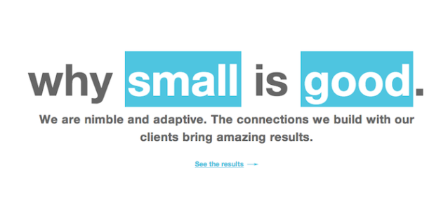
Next, we worked on our messaging with the goal of having our words become part of the visual design, not added after the fact. The result was a list of statements, such as, "We're a small company" and "We connect with our clients." We then expressed these facts in ways that created memorable images in readers' minds, such as, "Why Small Is Good."
The last step was to design the website, pulling everything we had created into a single, cohesive solution. Our design team started the process by showing us some mood boards to get a sense of direction. From there, they took it and ran!
![]()
Mood Boards
The Truly Rich, Live with Little
Our previous site had accumulated copious amounts of content. Managing our services, news, blog, and client list quickly became unwieldy. Our new fully responsive website had to be focused and agile while empowering our content authors and marketing team. How'd we do it? By using the right tools:
- The site is Twitter Bootstrapified to be 100% responsive and mobile friendly
- We choose Drupal as our CMS platform. It gave our web development team the flexability and power needed to build a fully integrated website, while giving content authors robust tools to create and share content.
- In keeping with our agile requirement, we integrated with 3rd party tools like Knight Lab's Timeline JS, Google's Tag Manager, MailChimp, AddThis, OnePageCRM, just to name a few.
- We got social with Instagram, Twitter Cards, OpenGraph, and Rich Snippet Microdata galore
- Finally Our DevOps team provided an extra boost in SPDYness by partnering with CloudFlare and Rackspace high-performance website hosting.
The Results are In
Numbers don't lie, especially when viewed through Google Analytics. Forty-five days since we re-launched the new website design, we have gathered some interesting statistics. Compared to the same period last year, pageviews are up by 10% and users are up by a 37%. On top of that, mobile usage has increased by a whopping 134% and our sales team is excited to see our overall goal conversion rate increase by 30%.
Making the Internet a Better Place
Making the Internet a better place is one of the reasons why we exist as a company and as a dedicated group of talented web designers and developers. We're happy we succeeded in building a better browsing experience for all our site visitors.